Revisiting Robert Royston’s Mitchell Park
The park formed the center of a “super-block” comprised of schools, churches, a fire station, Little League fields, and senior living facilities. For more than 45 years, Mitchell Park has served as an important example of postwar park design by being one of the first of a new breed of community parks. Its innovation came from accommodating changed living patterns that placed greater emphasis on the exterior environment and more active recreation activities.
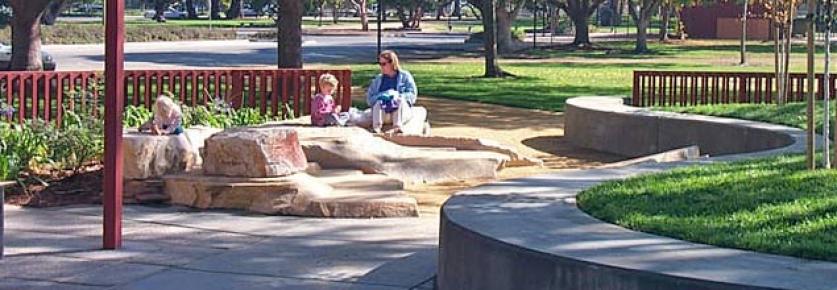
The noteworthy plan for Mitchell Park came from landscape architect Robert Royston, an innovative landscape architect practicing in the San Francisco Bay Area of northern California. His unique perspective on parks and his innovative design solutions gave the park a special character that has encouraged residents and users to cherish and protect this classic public space. With the help of Royston and an active community of park users, the rehabilitation of Mitchell Park has maintained its historic integrity while being adapted to modern living.
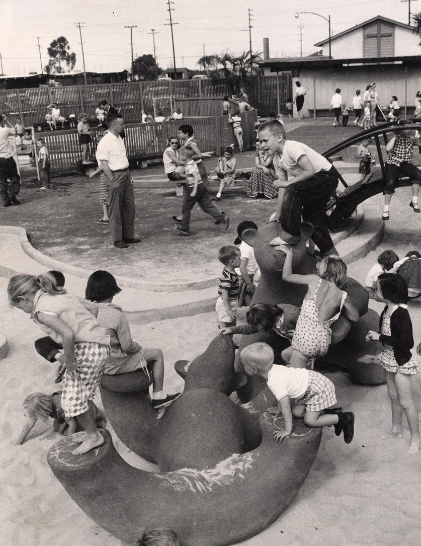
The postwar housing boom created many new housing areas, neighborhoods full of young and growing families who appreciated parks. Bob Royston’s design of Mitchell Park used patterns and ideas of twentieth century art to create forms and geometry that were more functional and less formulaic or symmetrical than earlier park designs. He incorporated ideas about landscape and gardens from non-European sources, and paid special attention to the psychological, social and actual physical needs of different user groups, particularly children. Royston became known for his designs in the years after World War II while working with Garrett Eckbo and later with Asa Hanamoto. He had initially trained in the office of landscape architect Thomas Church, well known for his garden designs. Although Royston initially pursued the innovative design of gardens, growing public demand for outdoor recreation soon brought him to the design of public parks.
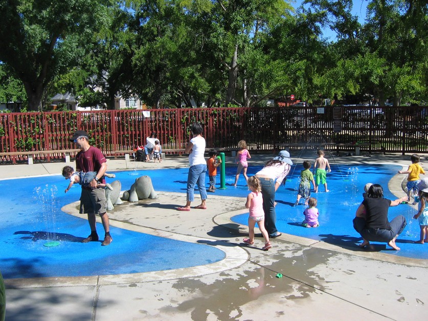
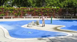
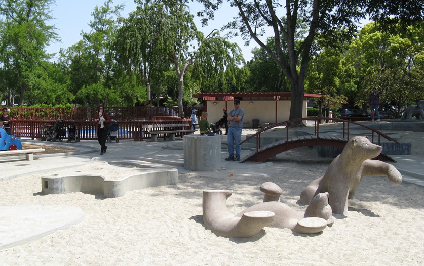
The people of Palo Alto have loved Mitchell Park for almost 50 years and have used it heavily for general recreation, special events, picnics and children’s play. Children who grew up with the park in the 1950s and 1960s have now become adults, forming families of their own and returning to the Mitchell Park neighborhood. Many unique features attract users to Mitchell Park. Low curvy forms and simple vertical lines within the park reflected influences from twentieth century artists such as Calder, Miro and Mondrian. The children's play area encompassed a multi story “apartment house” and slide, bear sculptures, a curvy wading pool, “gopher holes,” and a “freeway” with a gas station and garages where kids could park their big-finned cars. Park light fixtures, inspired by the design of traditional Japanese paper lanterns illuminated curving pathways. The affection that the Palo Alto community has for Mitchell Park today has come from a long-term loyalty and use fostered by the wonderful qualities built into the original design.
Although the park is loved by its community, no public facility can survive for 50 years without some renovation. City staff began the rehabilitation process by selecting Dillingham Associates, landscape architects, to prepare a detailed inventory of park conditions and then the necessary design and construction documents. Initially the city’s concerns for the rehabilitation of the park and play areas were practical. They needed to bring it into compliance with current safety codes. The idea of an historic rehabilitation hadn’t been seriously considered, given all of the safety requirements, costs, and diverse public opinion. A well-attended series of public meetings brought comments from more than 100 members of the public. Many of the attendees were parents with an active interest in a “state-of-the-art” play area – something new and innovative. However, late in the public process a member of the community who was interested in historic preservation pointed out the historical value of the park and play areas. Based on the previous public comments, the City and designers were initially reluctant to change the design direction from “state-of-the-art” to historic rehabilitation. However, the movement for park preservation gradually took hold throughout the community. As the public came to understand the regional and historic value of the park, they began to pressure the City to take on a project that balanced design and historic preservation concerns. Once the City staff understood that there was a significant value to the park and that the community would support an effort to save it, they embraced the idea as well. The City’s decision began a much more exciting and challenging project for everyone.
Luckily, Royston, the original designer, was interested in contributing to the project, and was open to changes that would be necessary to meet current standards. He understood very well the current issues facing landscape architects, like safety zones, accessible routes, and head entrapment hazards. Of course Royston was nostalgic about the old play structures, everyone loved the apartment house, the “Picasso Horse” and the Freeway, but short of being roped off in a museum, these elements could not comply with current safety standards for a public park. In the end, quite a few elements were saved, like the gopher holes and the beloved bears, leaving opportunities to develop new elements like a reading circle, and a kitchenette for birthday parties at the tot-lot.
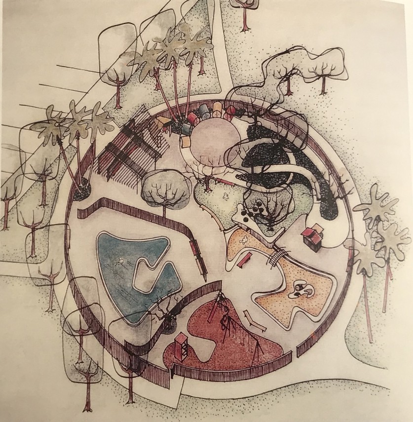
As the original designer, Royston was able to clearly communicate the project’s initial design intent. It became apparent that the key to his creative approach to the design of the play area was to focus on a child’s perspective of the play area, not the usual adult perspective. This meant manipulating the scale of the play area so that children, rather than adults felt at ease. Understanding this basic concept was an important break-through for the rehabilitation project. Despite the many challenges much of the park is quite beautiful today, in fact much more so than when it was first built. In photos the original immature landscape seems flat and almost barren compared to the rolling lush mature landscape of today.
Based on comments from Royston, Dillingham Associates Landscape Architects faced the delicate task of making necessary changes to bring the park up to current codes without disrupting the historic integrity. Basic design elements of the park, characteristic of post World War II park design, including the wild curvy shapes, subtle ground plane shadows, and thin elegant verticals were important design details that seemed somewhat foreign and almost counter-intuitive at first. It took time to come to understand the design vocabulary and resist getting carried away by adding elements that did not belong. It was necessary to take a step back and question the reasoning behind adding each new element, and examine whether it would fit the park’s historic character-defining features and materials? Although self-discipline is very important, it was still necessary to have fun with the design, especially in the case of children’s play areas. An exact copy of a historical design wasn’t possible or even desirable.
In looking at some of the original photos of the park it was amazing to see how much some things have changed and yet somehow they are still the same. One image that comes to mind again is an original 1950s promotional photograph of the Multi-Purpose area. It shows a group of teenagers in a sunken concrete bowl roller-skating. The girls are dressed in poodle skirts and the boys are dressed in long pants and white collared shirts, and the racial demographic of the time was very homogeneously white. Fast-forward to Palo Alto 2003. The clothes, the equipment, and the kids are completely different. The equipment is now skateboards and inline skates and the background of the kids is now diverse and no longer homogenous. Gone are the skirts and dress pants, in its place, baggy tee-shirts and jeans. Despite changes to demographics and style, the Multi-Purpose Area, like Mitchell Park, is timeless, it is populated with kids doing what they have always done and will always do. In the end, the community, the city, the designers and Royston are pleased because Mitchell Park has retained its original historical character, is safe and is being used again.


