Hato Rey, Puerto Rico
El Montehistory continued
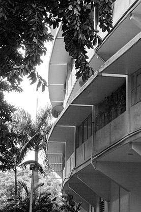
El Monte’s crescent-shaped buildings inherently possess an extraordinary level of significance. The distinctive unadorned design and geometric landscape evoke their essence, despite the tests of time and nature. True to the Modernist canon, lines and planes constitute the elements of design, while curved lines serve as organizing elements for the project. The shape, height, relationship between public and private realms all underscore the buildings’ landmark qualities. This concept is furthered by the scale of the buildings which contrasts against that of the surrounding neighborhood of predominantly single-family homes.
Predicated on the tenets of the Modernism, El Monte put to the test the idea of “the city in the park.”
From a landscape architectural perspective, the Barnes and Reed/Sasaki plan incorporated park and recreational areas, playgrounds, swimming pools, exterior vestibules, and uninterrupted pedestrian access. A continuous ground plane— exemplified by gardens and outdoor foyers—contributes to the sense that the buildings float atop a “green carpet.” The spatial sequence leads from the public realm, the street, to an open arrival area that frames vistas into the most secluded public areas, the gardens. Sasaki’s drawings specify planting material which differs from the actual mature palette on site. This may be partly due to Randolph’s involvement and later adaptation of the planting scheme during the project’s implementation, although conclusive data has yet to be identified.
