Shouldn’t a Museum’s Collection Include its Designed Landscapes?
Thoughts About Museum Expansions
(Note: This blog is based on the article on the same subject featured in The Architect’s Newspaper, June 16, 2010)
Flush economic times in the past decade resulted in ambitious museum expansions and expansion plans, while the recent economic downturn has led to the downscaling of some plans and a pause for others. This hiatus, from which we appear to be re-emerging, is not necessarily a bad thing. In fact, I believe it’s an opportunity for expansion-minded institutions to engage in a more holistic reevaluation of their proposed building and site expansion programs; one that would result in built work in which curatorial values previously placed solely on architecture and collections would be extended to include landscape, and both the physical and historical context for the museum would be given weight in planning and design decision making.
Two projects completed in the past decade begin to illustrate this issue. On the physical context side, new downtown museums seen as dynamic community centers opened in Minneapolis (The Walker Art Center, Herzog and de Meuron, 2005) and Denver (The Denver Art Museum, Daniel Libeskind, 2006). The Walker is a neighbor to the city’s oldest mapped parkland, Loring Park, known in the 1880s as Central Park, but there’s no sense of connection between the two. In Denver, the museum’s setting includes a significant landscape, Civic Center, one of the nation’s premier City Beautiful era designs whose continuum of planners and landscape architects includes Frederick Law Olmsted, Jr.; S.R. DeBoer; and Edward Bennett. Libeskind’s ambition did not stop with ignoring this National Historic Landmark-eligible public park—he completely redesigned it. Fortunately that design was rejected in 2007.
Those were lost opportunities vis-à-vis contiguity. In other instances, museum additions led to the demolition of potentially significant works of postwar landscape architecture. Take the recently unveiled expansions at Richmond’s Virginia Museum of Fine Arts (Rick Mather, May 2010) and the Tampa Museum of Art (Stanley Saitowitz, February 2010). Both had landscapes by Presidential Medal of Arts Recipients, landscape architects Lawrence Halprin (Virginia) and Dan Kiley (Tampa). Halprin’s 1974 commission was significant because it was his only realized design for an outdoor sculpture garden and he actually selected and sited all but one of the sculptures. Kiley’s 1984 commission for what was then NationsBank is considered to be one of his most important. The Kiley design was scheduled for demolition as part of the 2001 Rafael Viñoly $76 million expansion plan. The plan was scrapped due to cost, and the Kiley design may yet be restored.
Collectively, these examples raise questions about the management polices at these institutions and the challenge to extend stewardship practices beyond art and architecture to include landscape.


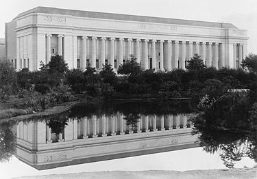
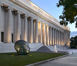
Boston Museum of Fine Arts historic view from the Fens (left); contemporary view (right). Courtesy Boston Museum of Fine Arts.
With this as a foundation, let’s turn our attention to three even more recent projects. Expensive new designs (collectively exceeding $750 million), significantly extending historic building footprints have been announced or unveiled for the Isabella Stewart Gardner Museum (Renzo Piano, January 2010), the Boston Museum of Fine Arts (Foster + Partners, May 2010), and the Kimbell Art Museum (Renzo Piano, May 2010).
The press release for the Kimbell project characterizes Piano’s addition as a “dialogue with Louis Kahn,” an idea echoed by The New York Times architecture critic Nicolai Ouroussoff in his May 27 article “Two Architects Have a Meeting of Minds at a Texas Museum”. Ouroussoff wrote that Piano’s addition is set 90 feet to the west of Kahn’s building in an area that is “currently a vast lawn dotted with trees.”
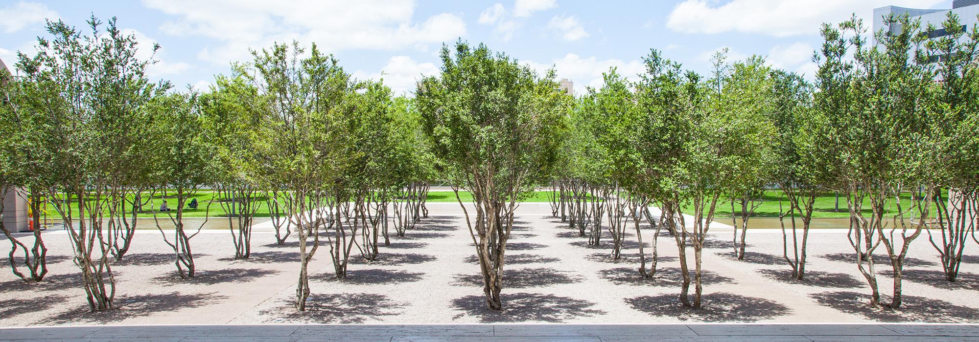
Not mentioned in the press materials or that article is the dialogue Kahn had with his patron about that “vast lawn dotted with trees.” In a June 1969 letter to Mrs. Kimbell, he wrote: “the west lawn gives the building perspective.” Accompanying the letter was a sketch of the project with portions labeled “MUSEUM” and “ENTRANCE OF THE TREES” in bold-faced caps.
I too wish I could have a dialogue with Lou Kahn. If I could I would ask him why he decided to preserve the pre-existing grove of trees? Were culture and nature meant to echo each other with his new design? Was the existing allée a parallel structure to the portico he was proposing? Was he also honoring the connection to the larger neighborhood context and the existing allées that crossed West Lancaster to the south? Is the processional arrival experience from the west lawn, to the allées, to the Yeopan grove in the gravel courtyard a narrative in which architecture grows out of the landscape?
I thought about the concept of a processional arrival experience and the idea of architecture growing out of the landscape as I reviewed the press materials for the Gardner and the MFA (or the New MFA, as it has been rebranded). Both are contiguous with the Back Bay Fens of Boston’s Emerald Necklace Park System. Frederick Law Olmsted designed this chain of open spaces between 1879 and 1892. The Necklace is the first urban greenway in the world and is a potential World Heritage site, according to many landscape historians.

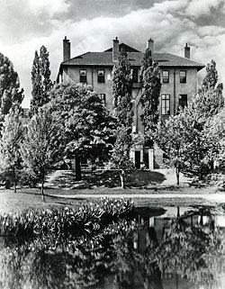
Gardner Museum from the Fenway, 1932.
Courtesy Gardner Museum of Art.Gardner knew the neighborhood well having owned a residence on Beacon Street since the early 1860s. She also knew Olmsted. He consulted on her Brookline estate, Green Hill, from 1886-1887, and records show she was still in communication with the firm as late as 1895. Gardner would have seen the build out of the Necklace as it progressed, and wisely realized that this site would provide unrivaled views up and down the Muddy River. It was no accident in 1898 that she purchased this particular plot of land on the Fens, or that she named her villa Fenway Court.
Immediately to its east, the MFA, designed by Guy Lowell, opened in 1909, six years after Fenway Court. With entrances on both the Fens and Huntington Avenue the MFA reached out into the Back Bay community on its city side and park side. (Like many urban parks the Necklace fell into disrepair in the 1970s and during that decade the MFA closed its Fenway side.)
In June 2008, after being closed nearly three decades, the original Fenway entrance was reopened as part of the Foster + Partners plan. In a recent conversation with MFA director Malcolm Rogers, he said one of the goals of the master plan was to “make the museum part of the park” and that from the start Foster told him, “you must respect your existing building, its language, and its associated processional experience.” Foster, Rogers says, went on to note that you have “to live with what your architecture is telling you to do.” For the MFA and its consulting landscape architects, Gustafson Guthrie Nichol, this was very much a guidepost. In fact, Rogers would “like to see a full restoration of the Fens, making it a potent urban recreational area so that one can enjoy the Muddy River as they walk in a friendly environment buzzing with life – a great park in a great city.”
Contrast Foster’s approach to Piano’s, which is closing its entrance on the Fens (except for special events) and relocating it around the corner. The Gardner’s museum director Anne Hawley claims the 70,000 square foot requirement for new construction and anticipated increased visitation necessitates this action. According to their press release, Piano “has responded to the Museum’s need for functional space by creating a conversation with Isabella Gardner’s Museum.” Is this a conversation or an echo chamber? Here we go again.
What are the values and what is the context for guiding change? How do we measure success? The former Boston Globe architecture critic Robert Campbell (and Gardner project consultant) recently noted that Piano’s building suggests “all the arts, from Titian to a well-turned double play, are present in the Fenway.” Moreover, in an article about the project this past January, Nicolai Ouroussoff suggested “the preservationists should put away their torches and pitchforks.” And then what?
It is worth noting that neither of these journalists mentioned Olmsted. Nor do they mention Gardner’s whimsical 1907 carriage house, a structure demolished last July to make way for the new building and its reoriented entrance. This structure, inspired by a building in the southern Italian town of Altamura, was a contributing feature to what may have been the only surviving villa complex in the Back Bay. Hawley said that after “five years of planning we concluded that moving or gutting the building was not an option.” How did we get back to tabula rasa? Wasn’t the architect up for the challenge? Moreover, how do we get invited to the private séances where celebrated architects converse with deceased architects and patrons?
Can holistic curatorial stewardship be achieved in the 21st century museum design? Is there an opportunity for reflection? Let’s see every student of architecture, planning, landscape architecture, historic preservation, and museum management high tail it to the Back Bay to compare and contrast and judge for themselves. For all the celebrated transparency and light in these new centers of energy why are we and the historic designed landscape all too often left in the dark?
(top left) Aerial of the Kimbell Art Museum, Fort Woth, TX, 2010. Courtesy Google Maps.


