Dreams Do Come True: Cleveland Straddles the Divide
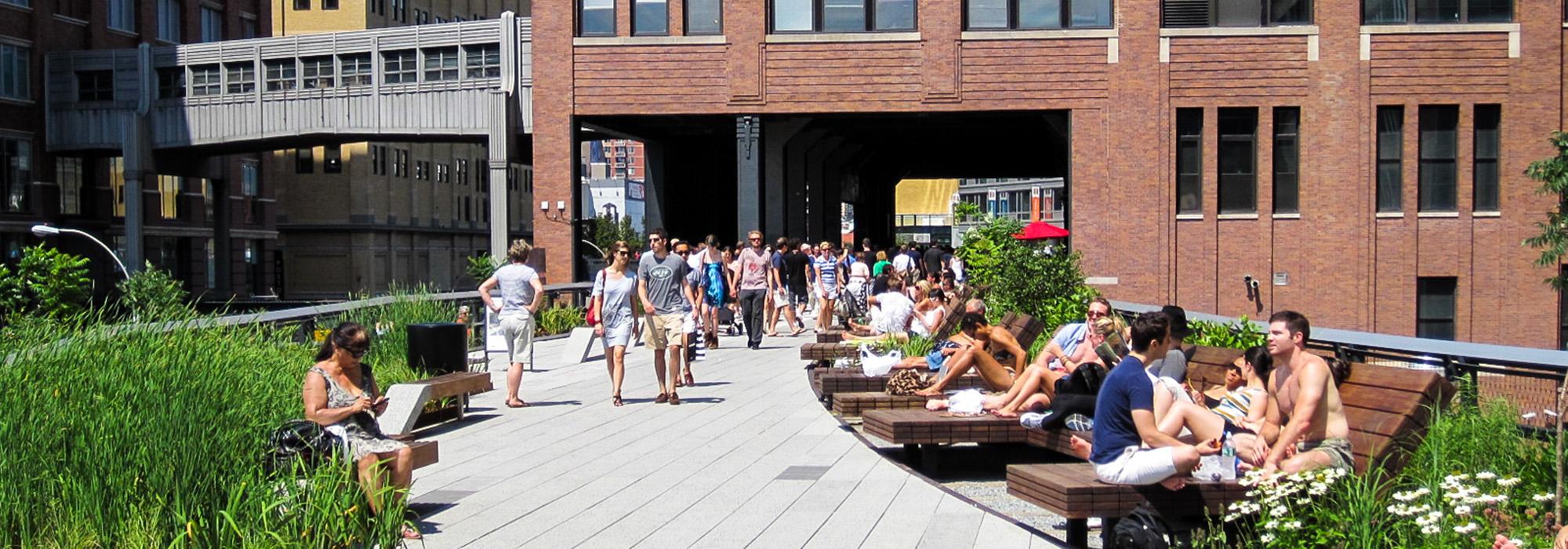
Christopher Marcinkoski, a senior associate with James Corner Field Operations in New York City, recently gave me an overview of several of the firm’s projects. I continue to marvel at their work on the High Line, the abandoned early 20th century elevated train tracks that have been turned into one of New York’s 21st century cultural gems. The project brilliantly weds fields, I’ve argued, that are often seen as adversarial, landscape architecture and landscape preservation. In fact, the work at Field Operations appears to embrace a design ethic I’ve long advocated, involving a shared value system of nature, scenery and culture, and strengthens the need for us to develop professional standards and ethics regarding cultural systems.
The project that caught my eye, and prompted this blog post, is the rehabilitation of a ten-acre public space in the heart of Cleveland. The original project is a classic City Beautiful expression, typical of prosperous late 19th/early 20th century cities such as Indianapolis, IN, Kansas City, MO, Syracuse, NY, and elsewhere.

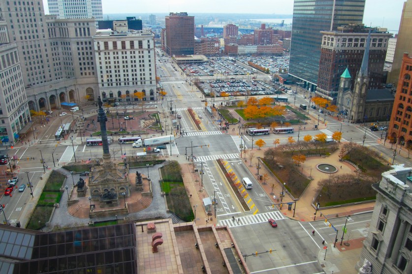
The four-acre core, Cleveland’s Public Square, modeled after a New England town green, was originally laid out in 1796 by the Connecticut Land Company as part of their expansion into the Western Reserve. The Square was added to the National Register of Historic Places in 1975, and is surrounded by an impressive architectural array: the Old Stone Church (listed on the National Register in 1973), the Gothic/Romanesque Society for Savings building (designed in 1899 by Burnham and Root and listed on the National Register in 1976), the iconic Art Deco Terminal Tower (also listed in 1976), and the state’s tallest building, the 980’ tall Key Tower (designed by Cesar Pelli). In many ways, Public Square has served as the city’s civic core.
In recent years, however, the sqaure has been quadrated and parsed into isolated units, with each segment now dominated by transit and over-scaled roadways – these remaining “plaza” portions have surrendered critical public space to vehicular circulation. Years of poorly designed, piece-meal transformations have collectively diminished Public Square’s civicness.

Fig. 2
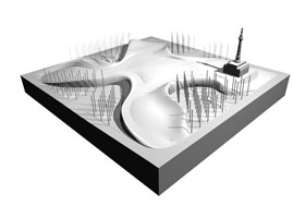
Well – dreams do come true – the Field Operations team has come up with a proposal that aims to reconfigure the square (Fig. 1) – using forms that are both picturesque (in the tradition of earlier town squares and greens) while also appearing thoroughly modern (in the tradition of Isamu Noguchi’s sculpture forms).This involves the creation of an ingenious web-like mound – a landform (Fig. 2, right) that unites the four disjointed quadrants of the square by bridging over the existing roadways that currently intersect at its core. Transit/vehicular accommodations would run below the mound, subordinated and separated (in the Olmsted tradition), opening up unobstructed pedestrian access and movement between the major destinations in and around the Square.
The pedestrian area elevated over vehicular traffic reinterprets the town green, while its four perimeter coves, all at street level, provide active public spaces, each scaled and programmed to serve their contiguous buildings. In addition, these street level plazas would be animated with small retail facilities (coffee shop, news stand, etc.) tucked beneath the mound rising above, and by public transportation connections to Cleveland’s University Circle district.
So, three cheers to Field Operations’ inspired design. They’ve demonstrated what I believe this profession needs to implement – a shared value design ethic – rather than an outdated “silo” mentality that separates nature, scenery and culture, which has left us with a legacy of lousy design. Let us know what you think – and better yet, tell the Plain Dealer Editorial Board (Read their recent story).


