Park Central Square: The Real Story
The Design Process, as Remembered by George McLaughlin
Landscape Architect Project team: Lawrence Halprin & Associates- George McLaughlin - Project Manager/Designer, Ken Reeves, Peter Van Dyne, Larry Guthrie
Client: The Downtown Springfield Association, Wilbur Wood - Executive Director
George McLaughlin tells the story of Park Central Square.
Springfield is located in the Ozark region of Southwest Missouri. Park Central Square is located at the center of the town and was always the main shopping area.
In the early 1960’s, the shopping area began to suffer from competition from new suburban shopping centers. This was a problem afflicting many older downtown shopping areas all over the country. One of the most common responses was to attempt to “save” downtown by improving it. Springfield was no different. In 1969, the Downtown Springfield Association set out to find a design firm to improve the square. They settled on the office of Landscape Architect, Lawrence Halprin to do the work.
By this time, Halprin and his partners had established a national reputation for innovative landscape design. I was a young architect/associate in the firm and was selected to be the project manager/designer on the project. One of the great things about the Halprin office was that you were given a great deal of freedom on the jobs. Halprin and his partners had spent the last twenty years developing the Halprin design vernacular. Staff members were expected to respect it but were not expected to slavishly copy it. Halprin expected constant innovation.
I had been at the office for five years and was well versed in the Halprin vernacular and was very excited to be given the job. As was typical in the office, I started out by reviewing all the drawings and information provided by Springfield. I then prepared three or four schemes for review with Halprin and one or more of the partners. In this review, one scheme was selected for further study and ultimate presentation to the clients.
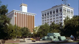
The Springfield square is different from traditional squares in that the streets enter it at the center of each side of the square rather than the more traditional corner entries. As such, the square has a wonderful sense of enclosure. The surrounding buildings for the most part were old and quite handsome. Unfortunately, at the time we started our work, the square itself was a barren windswept area bisected by roads. What wasn't roads, was small parking lots. It was not pretty.
From the beginning, our plan was to develop the entire square as a traffic free pedestrian area. Removing all traffic was made feasible because the city had developed a traffic couplet on adjoining streets that allowed traffic to bypass the square.
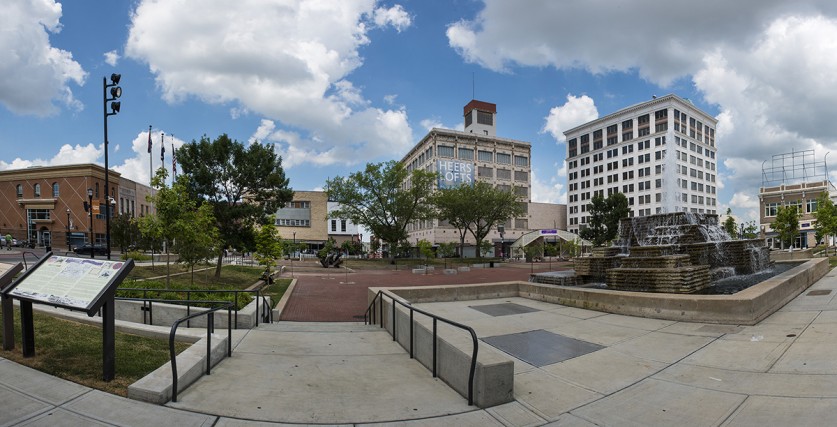
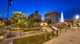
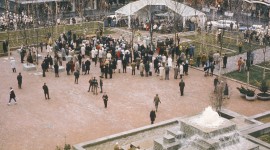
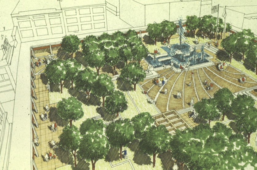
The central feature of the square was to be a slightly depressed, paved central plaza that would cater to large public gatherings. This plaza would be surrounded by grass terraces separated by concrete steps. We planned a fountain as a focal point. Also included would be seating areas, a gazebo/sun shelter, street furniture, accent planting, etc.
Trees, large and small, would be provided throughout, to provide a sense of enclosure and shade. We also included a canopy to shelter the surrounding sidewalks at the store fronts to unify the sense of enclosure and provide a more comfortable shopping environment. I prepared, with ongoing input from Halprin and the partners, a set of presentation drawings for review with the clients in Springfield.
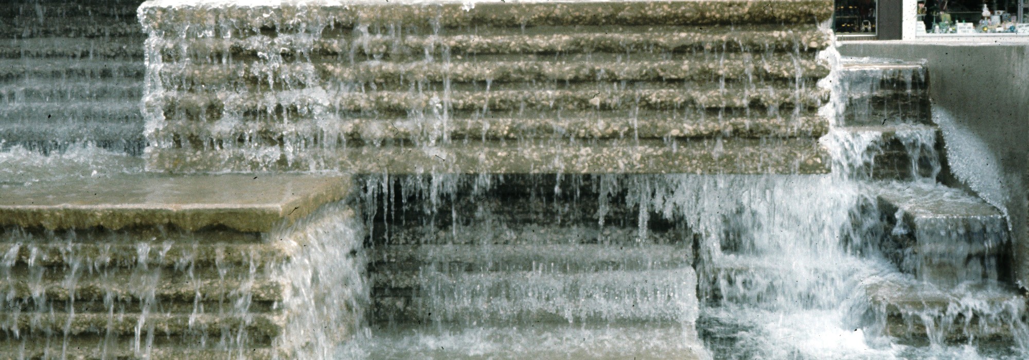
While I was in Springfield for the presentation, which went quite well, I spent time gathering more information and driving around to get a better sense of the area. It was during one of these drives, that I saw water flowing over the fragmented limestone ledges that would become the inspiration for the fountain. It was on this trip that I learned that a very generous Springfield resident had offered to donate a site specific piece of sculpture to be placed in the square.
After much work and several more trips to Springfield, we got final design approval. One change that came out of one of these trips was to make the complete removal of the cars part of a future phase. We prepared a set of construction documents for this future phase. With this change, we then prepared construction documents and the job was put out to bid. The bids, with some massaging, were accepted and construction commenced. After about a year of construction, the beautiful new square was dedicated to much acclaim.
The choice of brick for the plaza paving was inspired by the original brick used in the streets in Springfield. The entire street area of the square was originally paved in brick that had been covered with a layer of asphalt. Our original plan was to dig up and reuse the existing, very handsome “Buffalo Block” pavers for the plaza. We were not able to do this because the bricks could not be cleaned well enough for reuse. A different new brick was used instead.
The Fountain
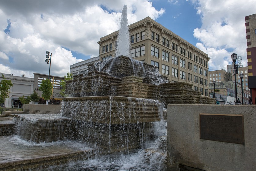
As previously stated the fountain design was inspired by the limestone ledges in the Springfield area. To get the ripply water effect, we used a corduroy finish on the fountain edges. This finish was inspired by the finish used on the exterior walls of the then new Arts and Architecture building at Yale, designed by Paul Rudolph. At Yale, the ribs are vertical, at Springfield they are horizontal. The finish was achieved by placing wooden rib shapes in the concrete formwork. When the forms were removed, the workers were to pound the ribs with heavy hammers to get the naturalistic effect. It was not easy to convince the contractor and his workers that it was OK to seemingly destroy a finish they had worked so hard to achieve. With a little bit of encouragement, they got into the spirit of the process and did a beautiful job. The water effect was just as we had desired. Thank you, Paul Rudolph. A major theme in all Halprin fountains is user participation. Larry liked for people of all ages to wade or play in the fountains. As such, part of the design was to make the fountain friendly to little feet. Grills were placed to protect most of the jets and lighting from damage. Also the fountain has to look good when it is not running, which a good part of the winter. The grills are simplified horizontal surfaces and minimal mechanical clutter help to make the seasonally non-operative fountain more pleasing to view.
Lighting
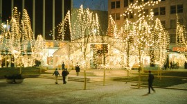
Provision for lighting was provided in a variety of ways. The overall ambient lighting was provided by the placement of two large downlights on top of one of the taller buildings adjacent to the square. This idea was inspired by the lighting towers that once provided area lighting called “moonlighting” in residential areas in Austin, Texas. At ground level, additional soft lighting was provided by up and downlights in the trees. Twinkle lights were provided to add festive lighting. Additional festive lighting was provided by lines of large clear incandescent bulbs along the front edge of the canopy.
At the time of this design, the square was the prime shopping area in Springfield and it was felt that there was a need for sidewalk weather protection for the shoppers. We designed a very simple freestanding canopy to cover the sidewalk area in front of the stores. Many of the merchants were worried that the trees in the square would obscure the view of their store fronts and, more importantly, their signs. In order to address this problem, the canopy sign area was made very simple and brightly colored to show up through the trees. The problem then became, what color and what font. Surprisingly, all the merchants agreed to use the same font. The color and font decision came to me while on an American Airlines flight from San Francisco to Dallas where I would connect with Ozark airlines to get to Springfield. One of the purposes of the trip was to solve the color and font dilemma for the canopies. As I was putting my ticket away in its jacket, I spent some time looking at the American Airlines ticket jacket. The jacket was a very bold blue with a large, very bold, very white Helvetica font that contrasted beautifully with the blue. I immediately realized that I was looking at a possible solution to the color and font problem. The blue was a very strong blue that would read well through the trees. Even better, the bold font would please Larry who, under the influence of his favorite graphic designer Barbara Staufaccher, had begun to use Helvetica bold in a lot of office publications, business cards, stationery, etc. We in the office referred to Bobbie Staufaccher, who had studied graphic design in Switzerland, as the mother of Helvetica bold in the Bay area. I reviewed the idea with the people in Springfield and got their approval. I then gave the ticket jacket to the contractor and told him to use this font and this color. Two problems solved. We had already agreed to use a reflective material, as used on highway signs, for the signage letters. The final result was quite handsome.
Flagpoles
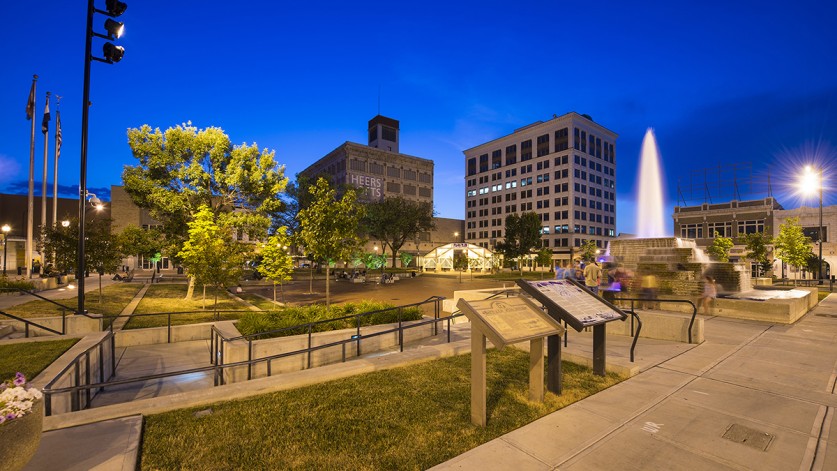
Three flagpoles are located at the Southern side of the square. Everybody I talked to in Springfield wanted flags. The problem was that the rules for flying the American flag specify that it must be taken down at night. The main concern was that there would not be enough staffing to take the flags down at night. The day was saved when someone in the planning department discovered that a flag could be left up at night if it is illuminated. We provided some lights and the problem was solved. As an added surprise, based on my understanding of the local patriotism, I specified a gold American Eagle be placed on the highest flagpole. They loved it. Sometimes it is the little things that make a difference.
The Gazebo
The gazebo was provided to create a sort of formal entry to the square. It also provides a sheltered seating area from which to view activities in the square. The gazebo was very loosely inspired by the much more abstract gazebo at Lovejoy Plaza in Portland, Oregon, an earlier Halprin project.
The Sculpture
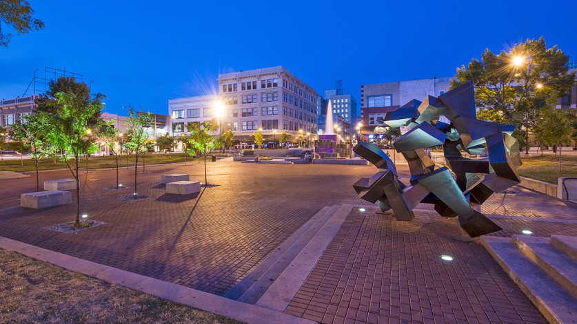
When I reviewed with Larry the very generous offer that had been made to pay for a sculpture, he suggested using Aristedes Demetrious, who had done a lot of sculptures on Halprin projects. Aris reviewed the plans and made three maquettes, or models, of possible ideas. He accompanied me to Springfield on my next trip. He presented the models to the donor in a group meeting with other city and downtown association members. She spent a lot of time looking at the little models and talking it over with the others and finally said, “I like this one”. It was great to see the donor get into the idea of an abstract sculpture. I think she might have been more comfortable with a more realistic piece. Aris packed up the little models and went back to San Francisco and got to work. His studio was near my house so I got to observe the progress. A few months later a very big, very nice abstract steel sculpture was delivered to Springfield for installation under his supervision. The sculpture turned out very well. All in all, the entire project turned out very well.
Epilogue
It is now 40 years later. The attempt to “save” downtown, like similar attempts in other downtowns, did not work and the area around the square went into a period of decline. The stores either closed or moved out to the new shopping centers. Recently, the area has begun to make a comeback. Instead of a shopping area, it is a center for restaurants, lofts, entertainment, etc. The plaza is still there, but it was never finished. The second phase that would have removed all auto traffic through the square was never completed. The plaza area is isolated from the surrounding uses by rather forbidding, hot in the summer or cold and windy in the winter streets. Due to this isolation, the square has never been used to its full potential.
There is now talk of removing the still beautiful, and now historic, Lawrence Halprin work. It apparently is still planned to retain the streets around a new plaza. This approach will not solve the problem of the new plaza being isolated from potential users by the rather forbidding street. It might be more appropriate to finish the original plan, i.e. finish the original second phase and make the square into the planned traffic free pedestrian area. The existing Halprin work, which appears to be in pretty good shape, could be repaired at a reasonably modest cost. The Halprin design for Park Central Square is a very good example of his work and is certainly worthy of a historic designation and retention.
Is the design for the Park Central Square in Springfield a Lawrence Halprin design?
The simplest answer is, yes, by any standard of professional judgment, the project is a Lawrence Halprin design. It is not a George McLaughlin design as was stated in the News Leader article [April 18, 2008]. George McLaughlin did work on the design while employed by Lawrence Halprin & Associates. George McLaughlin’s job was to work on the project, as Project Manager and Designer under the direction of Lawrence Halprin and his partners. George McLaughlin was expected to employ the Lawrence Halprin design vocabulary in his work.
This vocabulary had been developed over the previous fifteen or twenty years by Lawrence Halprin with the collaboration of his partners and staff. If George McLaughlin and the other staff members who worked on the Springfield project did not work within the Halprin vocabulary, believe me, they would have been quickly and properly replaced by staff members who would. Lawrence Halprin was very particular about his quality of work. It was perfectly honest for George McLaughlin to have told the reporter that he was the designer on the project. What he should have added that he was the ‘staff’ designer executing Lawrence Halprin’s wishes. This is the way that the business of landscape design, architecture, or most other businesses, for that matter, work. The owner of a large firm or business simply does not have the time to do all the work, and he hires people to help him execute the work. The credit for the work is properly given to the owner of the business.
As to the actual features of the Springfield square that make it a Halprin design. To one knowledgeable in the field of landscape architecture, it would take only one look to say, “that’s a Halprin design”. The slightly depressed plaza surrounded by tree spotted grass terraces defined by abstract concrete bands were very typical of Halprin designs of the time. The abstract, stepped fountain with water tumbling over the sides which beckons to user participation are also very typical Halprin, as was the street furniture, the Halprin flower pots, the Halprin benches. All typical. The whole design simply says, Lawrence Halprin. And it says it very well.
The Downtown Springfield Association selected Lawrence Halprin to execute a design for the square. The Downtown Springfield Association received a very good example of a Lawrence Halprin design.
George McLaughlin
May 8, 2008


