-
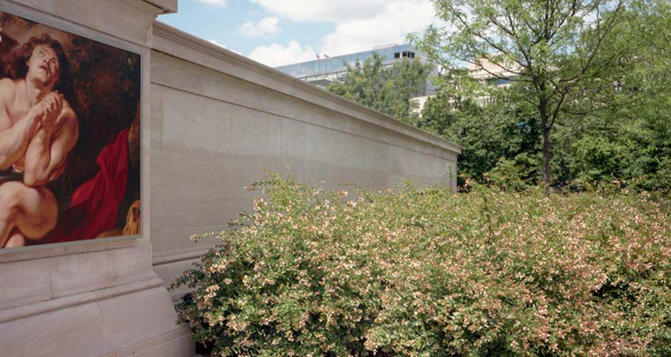
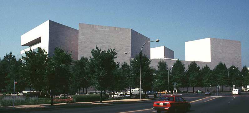
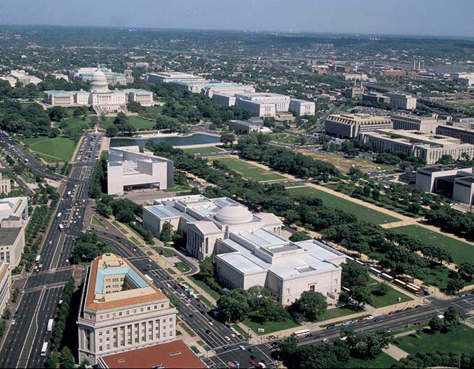
In the 1970s architect I.M. Pei was hired to design a new East Building for the National Gallery of Art, a modern structure that would hold the museum’s collection of contemporary art, house temporary exhibitions, a library and offices. The angular building was sited along the National Mall, located directly across 4th Street (one of several roads that provide traffic circulation through the mall) from the Greek Revival West Building, a monumental structure designed by architect John Russell Pope, which opened in 1941.

The office of Kiley Tyndall Walker was commissioned to create a pedestrian connection between the two buildings; their challenge was to find a way to unite the modern structure with the more classical one.
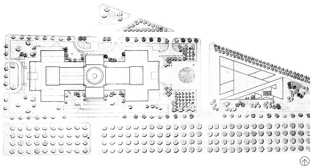
 At the front of the West Building entrance that faces the East Building, two bosques of magnolias were planted flanking the entry forecourt and softening the building’s façade. Because the two bosques are actually located atop an underground connection between the two museums, it was necessary to pick a species that required minimal root space. Each tree was planted in a raised two-and-a-half-foot-high mound, a design decision predicated by the limited soil depth. The mounds were originally covered in vinca, with boxwood hedges enclosing the groves. Further plantings included a grove of cherry trees on the mall side of the property and pin oaks, both on the West Building and East Building sides of the plaza. In front of the West Building, the modern angles of the East Building are brought into the design in jutting triangular glass skylights designed by Pei, which sit at the center of the plaza.
The simple design of the East Building’s entrance includes plantings of cotoneaster that provide a restrained groundcover. Kiley said: “At the East [Building’s] recessed entrance two massive points of the building’s triangular form rise cleanly out of the paved plaza. There is a contrast between the branch-, blossom-, and leaf-filled Gallery court, painted with splashes of shadow and light, undergoing changes with each season, and the unadorned visage of the East [Building], with no organic movement other than the daily play of shadows falling from its stone form … One is a palace in the park, at which visitors draw up to a green vestibule. The other asks visitors immediately and without pretension to enter within – that is where the richness and glory and content are found.”
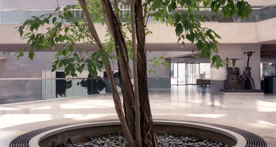
The East Building also features two roof terraces and trees planted on the main floor. One roof terrace outside the building’s boardroom overlooking the U.S. Capitol building was paved in triangular marble panels. A grid of wooden octagonal planters held tea crabapple trees that produced fragrant blooms in spring. The environment for the crabapple trees proved too hot and they were replaced with Styrax japonica (Common name: Japanese Snowbell) in the octagonal planters. A second similarly designed terrace sits outside the staff restaurant. Plantings here mimicked those from the first space, and Magnolia ('Little Gem') creates a green backdrop where it is espaliered on the walls. For the same reason, these original crabapples were replaced with crepe myrtle. Set into the floor of the building’s Atrium are tree-filled planters that create an interior garden.

The Gallery is currently in the midst of a large-scale restoration and interior gallery expansion of the East Building, begun with a Master Facilities Plan announced in 1999. In 2005 it became clear that the marble panels which Pei specified for the façade of the East Building risked detaching from the structure (the result of years of cumulative stresses to the panels’ anchor system). Plans were expanded to restore the façade, a process slated for completion in 2013. Further plans propose an interior expansion of the East Building galleries and creation of a new rooftop sculpture terrace, as well as restoration work on the grounds – recently the twin groves of saucer magnolias that sit outside the West Building were replanted. According to the Gallery’s Web site: “Some of the Yoshino cherry (Prunus x yedoensis) and willow oak (Quercus phellos) trees on the east and south sides of the East Building have been moved to an off-site nursery for the duration of the project. Others will be replaced with trees of the same size and quality upon completion of the project.” The two existing rooftop terraces will re-open in the spring of 2014 and the Gallery will maintain the integrity of Kiley’s design intent.
1 Kiley, Dan and Jane Amidon.
-
Ken Smith, FASLA, 2013
Dan Kiley, Modern Master of Poché
OK, I’m going to go micro here. Forget the big picture for a moment, let’s focus on the poché. I have always admired the two small bosques of Saucer Magnolia trees that Dan Kiley designed at the National Gallery of Art in Washington DC, working with architect I.M. Pei on the East [Building] and the exterior courtyard in 1978. These small, almost incidental bosques perform much the same the function as the thickened poché wall volumes that one finds in baroque architecture in giving form to configured space. The Kiley bosques are on one hand incidental but on the other hand instrumental to the success of the configured courtyard space they frame.
By way of context, the early design sketches for the courtyard space located between the original John Russell Pope building and the Pei addition show Kiley working through a series of classically inspired circular garden schemes centered and off-centered in the square courtyard. The final courtyard model illustrates a somewhat less classical circular scheme than the earlier studies with the circular forms pushed off-center and with circumferential canals bisecting the courtyard. Looking back at these early sketches and seeing the pervasive classicism of expression I must say I find it a bit shocking to see this coming from the hands of our modern landscape master. In the executed project however the circle remains only in the residual form of a ring of stone bollards, but centered within the bollards is a dynamic asymmetrical arrangement of triangular skylights and fountain that relate to the diagonals of the Pei building. There was a struggle going on about whether the circular space should show deference to Pope’s original building or to Pei’s modern addition. The modern addition clearly won the argument.
But back to the micro story of the trees. Kiley’s design intent was to frame the courtyard with two bosques of Saucer Magnolia trees. The tree groves sit over a below-grade pedestrian passage, bookstore and cafeteria that connect the two buildings. Above grade the bosques masterfully frame the courtyard space. The scale and spacing of the trees create compelling volumes of landscape space that relate both to the architectural massing of the buildings and to the scale of pedestrians passing alongside. The selection of the Magnolias wasn’t driven solely by artistic issues of scale and beauty but by structural weight limitations that precluded the planting of larger-scale trees. Restrained by the on-structure condition, Kiley innovated with each tree sitting on a low circular soil mound thus reducing the average weight load across the platform while meeting minimum soil depths required for the trees. This gesture elevated the trees both literally and figuratively. The ground plane is no longer uninflected but instead a modulated space with shadow and spatial depth. The trees rise above of the mere function of interstitial space to become sculptural forms within a spatial volume. Here you see the real skill of Kiley’s mastery in his unique ability to transform the residual poché common to so much landscape space into a singular work of art. He manages to create spaces that are both background and foreground simultaneously. Hats off to Daniel Urban Kiley, the modern master of poché.
-
Pei Cobb Freed & Partners. “National Gallery of Art, East Building,” http://www.pcf-p.com/a/p/6810/s.html.
National Gallery of Art. “About,” http://www.nga.gov/content/ngaweb/about.html .
The Cultural Landscape Foundation. “What’s Out There: National Gallery of Art, East Building Plaza,” http://tclf.org/landscapes/national-gallery-art-east-building-plaza.
Kiley, Dan and Jane Amidon. Dan Kiley: The Complete Works of America’s Master Landscape Architect (Boston, New York, London: Little, Brown and Company, 1999), 80-83.
“Landscape Design: Works of Dan Kiley.” Process: Architecture 33. (Tokyo: Japan, Process Architecture Publishing Co., 1982), 80-83.
“Dan Kiley: Landscape Design II.” Process: Architecture 108. (Tokyo: Japan, Process Architecture Publishing Co., 1993), 100-102.


